VICTORIA COLT
is an artist, color consultant, seasoned graphic designer, amateur photographer… or in other words, a creative. The medium is almost irrelevant. The subject matter is the driving force. In her case it is color.
ARTIST STATEMENT
While my large scale meditative color field paintings, COLOR STUDIES, are visually minimalistic and created with the impetus to explore the interaction and optical effects of color, they are also an investigation of something deeper. There is an energy, or tension, created from applying uninhibited color that is contained within defined and uniform boxes. This is also an apt analogy as each of us is a vibrant being shining within our own predetermined and often inescapable boundaries.
When my paintings are displayed as a collection all follow the same format and align. Yet each piece is unique and contributes its individual beauty to the whole. Upon close inspection the scale starts to envelop a viewer. Details emerge that went unnoticed at a distance. You begin to see layered colors, brush strokes, texture and color interactions that change with your perspective. Colors, like humans, appear to adjust themselves to whomever they’re with and however they are viewed.
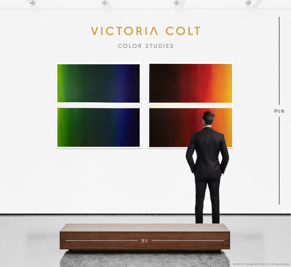
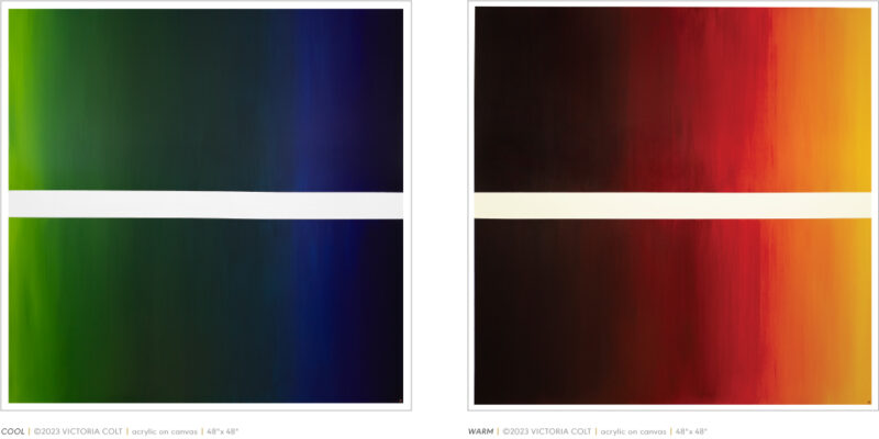
G. BIV ROY
A PAIR SHOWCASING A CONTEMPORARY INTERPRETATION OF THE VISIBLE SPECTRUM
“…BUT MAKE IT FASHION”
A CAPSULE COLLECTION OF COLORS THAT REFLECT THE GLOBAL AESTHETIC ZEITGEIST
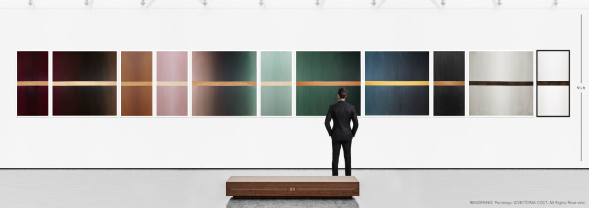
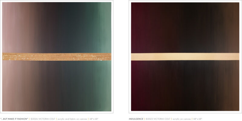
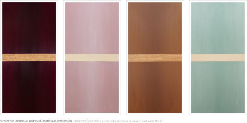
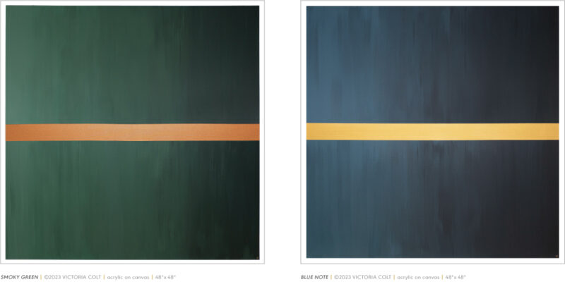
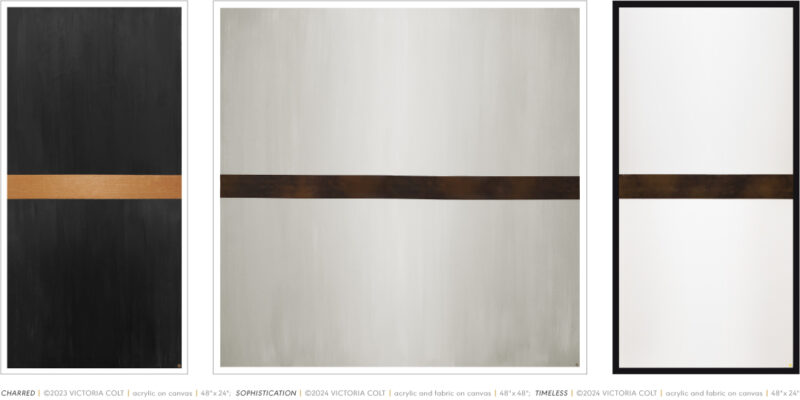
Artists rarely adhere to or follow trends but many of us have a finger on the pulse of global aesthetic currents. As a painter, color specialist and graphic designer my awareness of inventive solutions from creatives across a multitude of industries has been a professional necessity. I’m constantly inspired by unique colorways, architectural forms and interesting materials. This capsule collection, “…BUT MAKE IT FASHION” is an interpretation of the schemes that are resonating with my creative sensibility.
Each piece is an experiment in color, contrast or tone within a fashionable colorway. Color interactions occur regardless of a hue’s chroma and while I absolutely enjoy bright, vibrant palettes I am more interested in nuanced and luxurious tones. The power of a dark shade is especially intriguing. Dark values visually recede thus creating depth. They tend to intensify adjacent colors and can even make a straight line appear curved. The illusions colors create are fascinating.
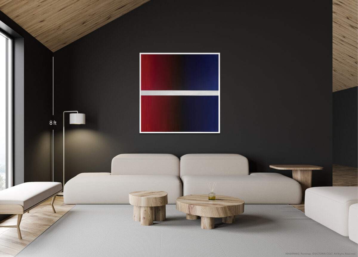
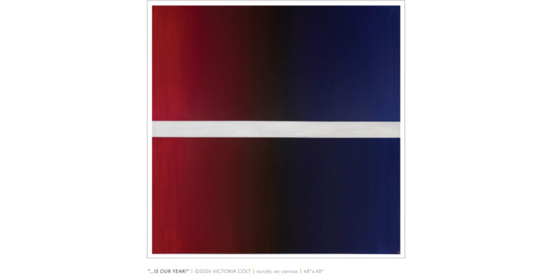
“…IS OUR YEAR!”
IN HONOR OF OUR FAVORITE TEAMS. SOMETHING WE HAVE ALL SAID DURING THE SEASON, “[THIS] IS OUR YEAR!” AND POST-SEASON, FOR MOST OF US, “[NEXT YEAR] IS OUR YEAR!”
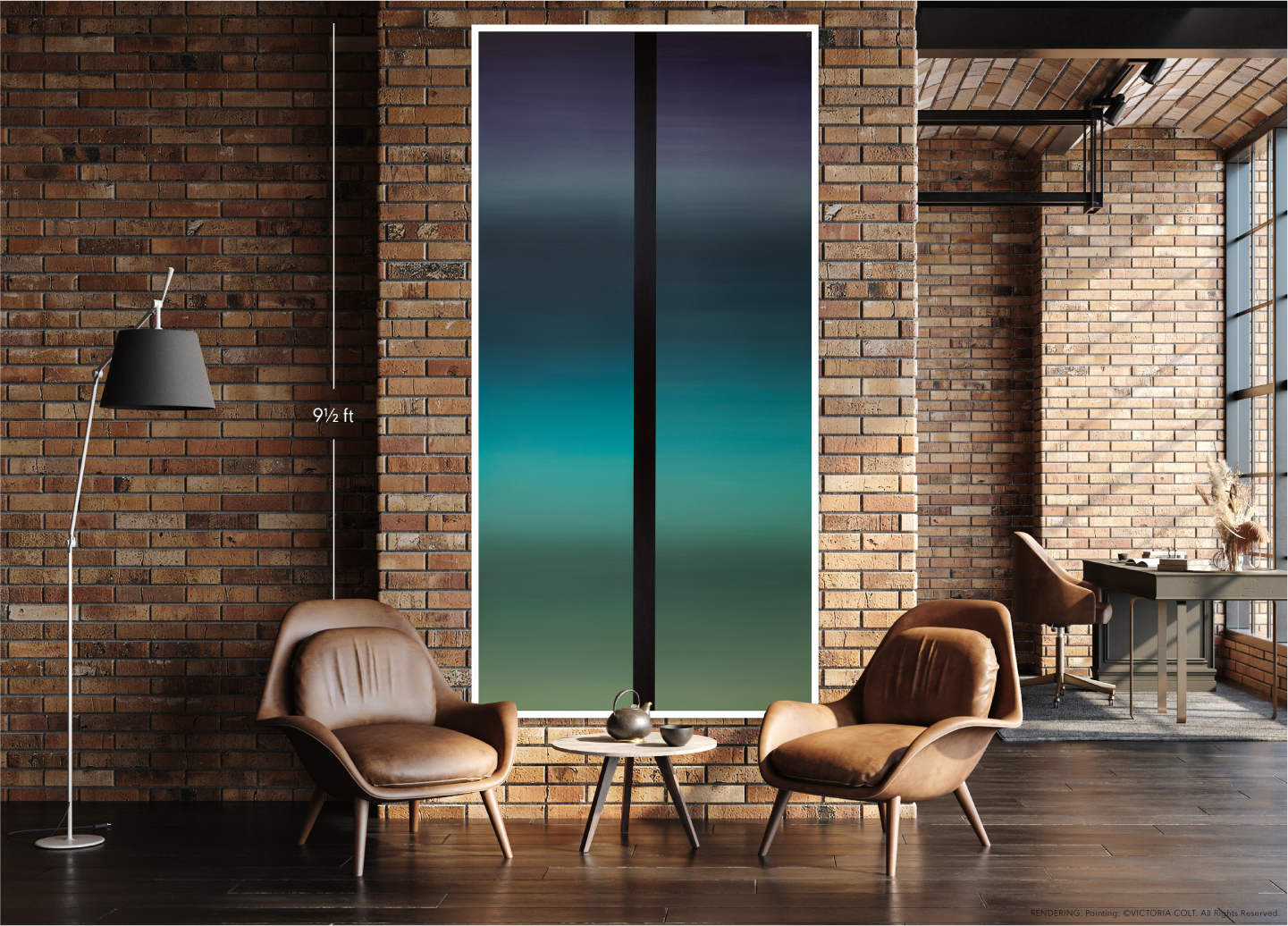
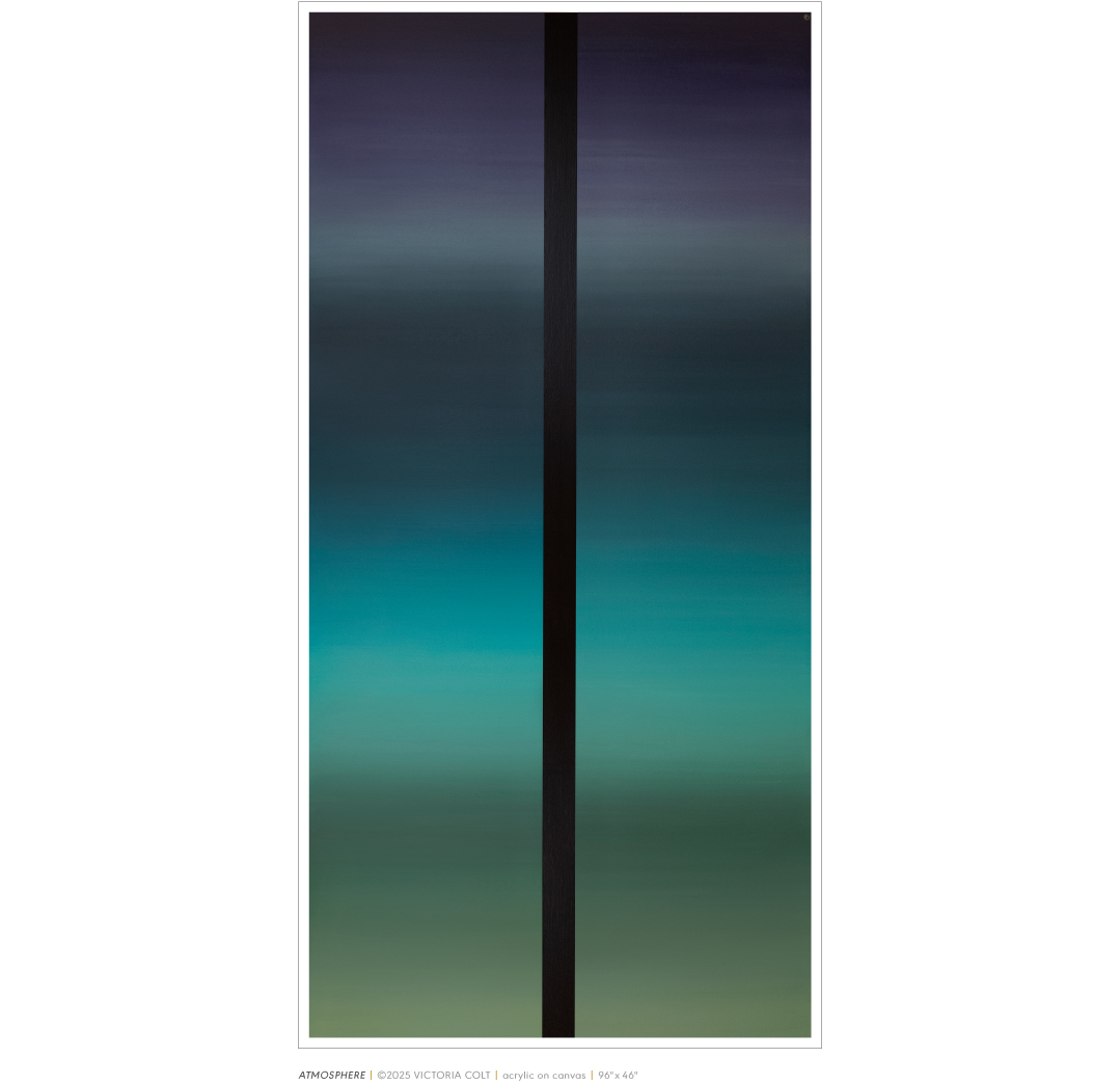
ATMOSPHERE
TESTING THE LIMITS (OF BLENDED COLORS) FROM EARTH TO SPACE.
